Free Fire Fonts: Pro Gamer’s 2026 Guide to Logo, GFF & Styling
If you genuinely want to build a massive YouTube following or crack into the competitive esports tier in 2026, you cannot ignore your visual branding. Your raw gameplay skills mean absolutely zero if your channel banners, stream overlays, and video thumbnails look like they were rendered on a broken tablet using default system text. Professional Free Fire creators obsess over typography. They rely on the exact visual assets Garena uses internally to instantly project absolute authority and command viewer attention. When a player sees that rugged, battle-scarred text styling, their brain immediately registers it as official, high-level content.
📋 Quick Answer: Typography Essentials
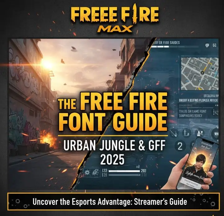
- The Main Logo: The iconic distressed text you see on the primary loading screen is called Urban Jungle, created by KC Fonts.
- The In-Game UI: The intensely readable text floating over airdrops and player heads is a custom-engineered typeface called GFF.
- Implementation: You can download `.ttf` formats directly into mobile editing apps like PixelLab without rooting your Android device.
This technical breakdown strictly isolates the typographic assets Garena deploys. Mastering these precise design variables elevates your entire digital identity from an average amateur to an elite broadcaster.
1. Urban Jungle: The Signature Logo Typeface
You instantly recognize the sharp, shattered look of the primary application logo. That aggressive grunge aesthetic relies entirely on a heavily modified typeface called Urban Jungle. Designed by KC Fonts, it specifically mimics raw street graffiti blasted over military stencils.
This typeface features severely distressed edges simulating worn-out metal, chipping paint, and concrete friction. It exists strictly for massive, explosive headlines. If you attempt to draft entire paragraphs using Urban Jungle, the visual chaos instantly triggers brutal eye fatigue. Because it visually screams intensity, it perfectly encapsulates the frantic drop-and-loot combat loop characteristic of high-rank Battle Royale lobbies. Elite creators universally download this exact `.ttf` file from major typography repositories to build flawless YouTube hooks that paralyze the scrolling algorithm.
2. The GFF Custom User Interface Font
Observe the floating numeric damage indicators when you execute a perfect drag headshot. Notice how incredibly distinct those red numbers remain, even when the background environment is exploding with Gloo Walls and grenade particle effects. That extreme optical clarity exists because Garena commissioned master typographer Akira Kobayashi to engineer an entirely proprietary geometric system named GFF (Garena Free Fire).
The development team required a massive architectural update to guarantee smooth rendering across millions of low-end mobile graphics processors across the Indian subcontinent. GFF deploys highly specific beveled cuts, projecting continuous forward momentum. The deliberately rounded terminal structures aggressively reduce eye strain during exhausting four-hour tournament blocks. Furthermore, they integrated native Devanagari translation matrices directly into the core code, permanently resolving the horrifying localized text corruptions that severely damaged earlier regional broadcasts.
3. Dominating Thumbnail Strategy
Merely possessing the font file means absolutely nothing if your layout lacks strategic contrast. If you want to secure lucrative diamond sponsorships, your graphic pipeline must mirror elite production studios.
Whenever you inject Urban Jungle into a video thumbnail to announce a "NEW MYSTERY SHOP" leak, you forcefully trigger the viewer's neurological association with the official game client. But you must execute it correctly. Always combine your primary text layer with an aggressive, saturated background gradient. Garena overwhelmingly favors the intense yellow-to-crimson fade pattern. More critically, you must apply a thick, dominating black stroke around the white letters. Without that protective dark outline, your text completely dissolves into the chaotic background map textures. Scale your graphics down; if you cannot read your custom overlay while holding your phone an arm's length away, the text remains practically invisible on a crowded YouTube feed.
4. Mobile Installation Protocol
Deploying these exact assets directly onto your smartphone involves a highly standardized operating system bypass. You do not need to execute messy device root commands.
If you operate a complete desktop rendering station running Adobe Photoshop, you simply extract the `.ttf` package and hit install. The system registry handles the integration instantly. However, if you manage your entire broadcast network directly from an Android device, you must utilize applications like PixelLab, Phonto, or alight motion. These specific programs maintain incredibly accessible custom font directories. You drop the raw file straight into the designated storage pathway, launch the application, and instantly secure the ability to manipulate drop shadows, inner strokes, and 3D extrusion parameters exactly like a desktop editor.
5. Crafting the Perfect Elite Lobby Profile
Player prestige heavily influences lobby dynamics before the match even loads into the airplane animation. If you harbor ambitions of joining verified V-Badge guilds, presenting a standard keyboard text name instantly disqualifies your application. Veteran shot-callers judge raw dedication based on aesthetic presentation.
Players obsessively utilize specialized Free Fire font style name generator platforms to aggressively manipulate unicode characters. They bend these unique typographic symbols directly into their clan tags, injecting invisible space characters, miniature weapon icons, and superscript trademark symbols. This intricate styling signals deep community integration and immediate technical familiarity.
Discussion
Leave a Comment